Projeksiyon ve yeniden sıralama simülasyonlarının Trade geçmişini fan grafiklerine, Drawdown aralıklarına ve test edilebilir risk sorularına nasıl dönüştürdüğünü öğren.
Tradeways'i geliştirmek için analiz çerezleri dahil çerezler kullanıyoruz. · Gizlilik
Tarihsel sermaye eğrin tek bir sonuç dizisini, yani gerçekleşen diziyi gösterir. Monte Carlo simülasyonu, aynı kanıtın birçok alternatif yolda nasıl görünebileceğini sorar. Trade'leri iyileştirmez veya piyasayı tahmin etmez. Geçmiş sonuçların sırasının ve tekrarının, yaşamak zorunda kalacağın yolu ne ölçüde değiştirebildiğini ortaya çıkarır.
Bu ayrım simülasyonu somut bir görev için yararlı kılar: Bir stratejinin görünürdeki istikrarının tek bir elverişli sıraya bağlı olup olmadığını test etmek. Sonuç bir tahmin değil, koşullu sonuçlar aralığıdır.
Bir trader, Trade geçmişine iki farklı soru sorabilir:
Projeksiyon: Bu filtrelenmiş örnekleme benzeyen sonuçlar sonraki Trade grubunda tekrarlanırsa hangi sonuç aralığı oluşabilir?
Yeniden sıralama: Aynı Trade'ler farklı sırada gelseydi yol ne kadar farklı olabilirdi?
Modlar aynı kaynak veriyi kullanır ancak farklı soruları yanıtlar. Bunları birbirinin yerine kullanmak, çıktıyı yanlış okumanın en hızlı yoludur.
Tradeways her iki modu da gerçek içe aktarılmış Trade'lerinden tarayıcıda çalıştırır. Etkin hesap kapsamı ve canlı Trade filtreleri girdiyi belirler; böylece kazanma oranı ve getiri tahminlerini yeniden yazmadan strateji, sembol, yön, dönem veya desteklenen başka bir filtreyi ayırabilirsin. Monte Carlo analizi kapsam değiştiğinde güncellenir ve sonucu tahmin olarak değil, geçmiş Trade'lerden oluşturulan bir simülasyon olarak etiketler.
Projeksiyon modu, filtrelenmiş tarihsel sonuçlardan her seferinde bir Trade çekerek her yolu oluşturur. Bir sonuç belirli bir çalışmada birden çok kez çekilebilir veya hiç çekilmeyebilir. Buna yerine koyarak örnekleme denir.
Sonraki 100 Trade gibi bir ufuk seçersin ve simülasyon süreci birçok kez tekrarlar. Çıktı, açık bir varsayım altında yolların ve nihai sonuçların ne kadar geniş dağıldığını gösterir: Seçilen geçmiş, tekrarlanabilecek sonuçlar için yararlı bir modeldir.
Projeksiyon, sorun geleceğe dönük ancak koşullu olduğunda uygundur. Pozitif bir tarihsel ortalamanın bile zararlı yollara, derin Drawdown'lara veya uzun toparlanma dönemlerine izin verdiğini gösterebilir. Stratejinin Edge'inin sürüp sürmeyeceğini, piyasa koşullarının değişip değişmeyeceğini veya gelecekteki Trade'lerin aynı dağılımı izleyip izlemeyeceğini gösteremez.
Yeniden sıralama modu, filtrelenmiş örneklemdeki her Trade'i yol başına tam bir kez kullanır ve yalnızca sıralarını değiştirir. Toplamalı P&L görünümünde bu nedenle her yol aynı toplamda biter. Değişen şey bu toplama giden yoldur: zarar serileri, sermaye zirveleri, toparlanma zamanlaması ve maksimum Drawdown.
Bu mod bir ilişkilendirme sorusunu yanıtlar. Tarihsel eğri düzgün görünüyor ancak birçok alternatif sıralama belirgin biçimde daha derin Drawdown içeriyorsa bu düzgünlüğün bir bölümü sıralama şansından gelmiştir. Drawdown dağılımı sıralamalar arasında dar kalıyorsa gözlenen yol, kazanç ve zararların ne zaman geldiğine daha az bağımlıdır.
Yeniden sıralama yeni Trade sonuçları oluşturmaz ve sonraki Trade grubunu tahmin etmez. Ayrıca özgün dizideki seri yapıyı bozar. Sonuçlar rejimlere, pozisyon çakışmasına veya büyüklükteki bilinçli değişimlere bağlıysa sonucu bu bağımlılıkların modeli olarak değil, sıralama testi olarak yorumla.
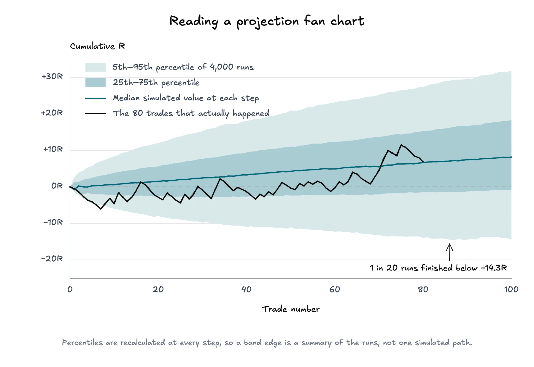
Fan grafiği yatay eksende Trade sayısını, dikey eksende kümülatif sonucu gösterir. Simülasyon her adımda tüm yol değerlerini sıralar ve yüzdelikleri işaretler. Medyan çizgi ortadaki simüle edilmiş değerdir. 5. ile 95. yüzdelik aralığı gibi daha geniş bantlar, simüle edilmiş dağılımın daha büyük bölümünü gösterir.
Örnek bir projeksiyon: Filtrelenmiş 80 Trade'lik geçmişten çekilen 100 Trade'lik 4.000 çalışma. Aynı kanıtla medyan yükselirken 5. yüzdelik yükselmiyor.
Grafiği üç geçişte oku:
Merkezi oku. Medyan, her Trade sayısındaki ortanca simüle edilmiş sonucu gösterir. Beklenen yol veya vaat değildir.
Genişliği oku. Hızla genişleyen fan, seçilen varsayımlar altında dizinin geniş bir kümülatif sonuç aralığı ürettiğini söyler.
Gerçek eğriyi karşılaştır. Tarihsel yol, gerçekleşen dizinin simüle edilmiş aralığa göre nerede durduğunu gösterir. Dış banda yakın bir yol bu model içinde sıra dışıdır; stratejinin veya emir gerçekleşmesinin olası her model için sıra dışı olduğunun kanıtı değildir.
Yüzdelik sınırları her adımda ayrı hesaplanır. Dolayısıyla 5. yüzdelik çizgisi tek ve kesintisiz bir simüle edilmiş yol olmak zorunda değildir. Gelecekteki sermayenin bunun üzerinde kalma olasılığının %95 olduğu anlamına da gelmez. Çalışmaların nokta nokta özetidir.
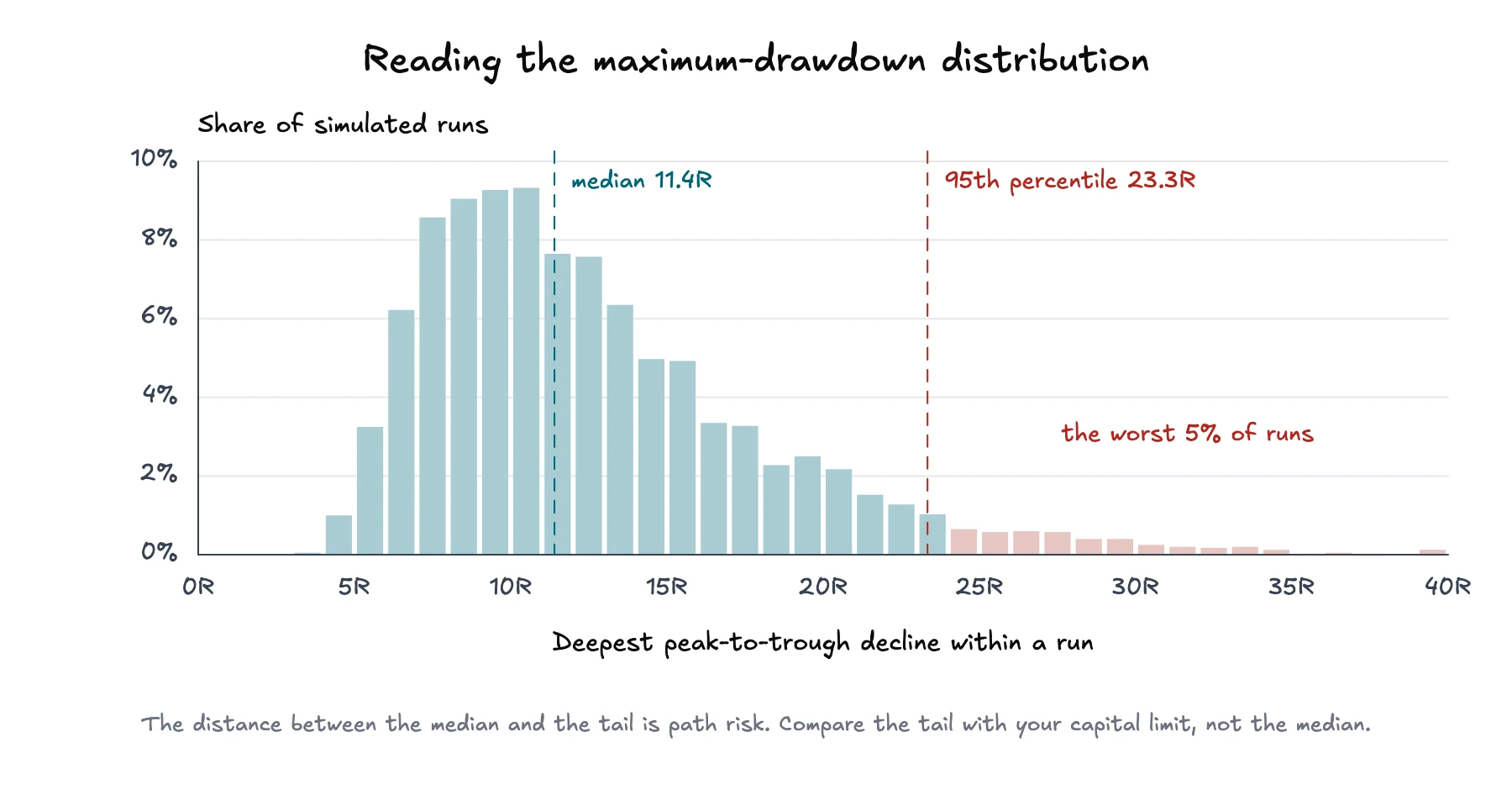
Fan grafiği kümülatif sonuçları gösterir. Drawdown dağılımı farklı bir soruyu yanıtlar: Her simüle edilmiş yol, toparlanmadan veya sona ermeden önce kendi önceki zirvesinden ne kadar düştü?
Simülasyon her çalışma için o yolun maksimum zirveden dibe düşüşünü kaydeder. Ardından dağılım bu maksimum Drawdown'ları gruplar. Merkezi tipik simüle edilmiş en kötü düşüşü, üst kuyruğu ise daha az çalışmada görülen daha derin düşüşleri gösterir.
Aynı çalışmalar, farklı bir soru. En kötü düşüşün medyanı 11.4R; her yirmi çalışmadan biri 23.3R'yi geçti.
Yalnızca ortalamaya değil, özellikle kuyruğa dikkat et. Katlanılabilir bir medyan Drawdown, çok daha büyük bir 95. yüzdelik Drawdown ile birlikte bulunabilir. Aradaki fark yol riski hakkında bilgi verir. Bunu sermaye limitlerinle ve stratejinin planlandığı gibi uygulanamaz hâle geleceği noktayla karşılaştır.
Bu, tükenme riskiyle ilişkilidir ancak aynı şey değildir. Drawdown bir yoldaki zirveden dibe kaybı ölçer. Tükenme, tanımlanmış bir sermaye eşiği gerektirir ve simüle edilmiş bir yolun bu eşiğe ne sıklıkta ulaştığını sorar. Elle belirlenen kazanma oranı, getiri, Trade riski ve sermaye varsayımlarını test etmek istediğinde tükenme riski simülatörü yararlıdır; Monte Carlo analizi ise filtrelenmiş, içe aktarılmış Trade geçmişindeki dağılımı kullanır.
Simülasyonu tek bir skor yerine karşılaştırma aracı olarak kullan.
Değerlendirdiğin stratejiye veya karara uyan hesap kapsamını ve filtreleri seç.
Çıktıyı yorumlamadan önce örneklemi kontrol et. Hariç tutmaların, eksik değerlerin ve eşleşen Trade sayısının kabul edilebilir olduğunu doğrula.
Toplam performansı sıralama şansından ayırmak için önce yeniden sıralama modunu çalıştır.
Medyan nihai sonuçtan önce maksimum Drawdown kuyruğunu ve zarar serisi aralığını oku.
Projeksiyon moduna geç, karar dönemine uyan bir ufuk seç ve fanın ne kadar hızlı genişlediğini incele.
Her seferinde savunulabilir tek bir filtreyi değiştir. Bir piyasa rejimini, Setup'ı veya hesabı kaldırmak dağılımı belirgin biçimde değiştiriyorsa tercih ettiğin sonucu seçmek yerine nedenini araştır.
Simülasyon gözlenen sonuçların örnekleme ve sıraya ne kadar duyarlı olduğunu söyleyebilir. Stratejinin Edge'ini doğrulayamaz, yanlı girdileri onaramaz veya pozisyon büyüklüğü seçemez. Pozisyon büyüklüğü ayrı bir karardır: Kelly kriteri güçlü varsayımlar altında büyümeyi en üst düzeye çıkaran oranı açıklarken tükenme riski analizi bir sermaye eşiğini aşma olasılığına odaklanır.
Monte Carlo sonucu girdilerine bağlı ifadeleri destekler: Bu filtrelenmiş örneklem, bu mod, bu ufuk ve bu çalışma sayısı altında belirli bir aralık oluştu. Gelecekteki getiri veya Drawdown'ın garanti olduğunu, sonuçların bağımsız olduğunu ya da filtrelenmiş örneklemin temsil gücünü koruyacağını söylemeyi desteklemez.
Bu sınırlama analizi bir kenara bırakmak için neden değildir. Kaynağı etiketlemenin, kuyrukları incelemenin ve temel Trade grubu değiştiğinde testi yeniden çalıştırmanın nedenidir. Değer, daha çekici bir sermaye eğrisi değil; aynı Trade kanıtının zaten içerdiği belirsizliği daha açık görmektir.